
Hello, my name is Jan and I have finally managed to tame my imposter syndrome enough to finally write an article for the the amazing Skrift magazine. Two years ago I wanted to write about progressive web apps. But with accessibility awareness on the rise I felt more motivated to share my thoughts about how to improve the accessibility of the Umbraco backoffice.
Friendly
Since the early days of the Umbraco project, founder and Chief Unicorn Niels Hartvig 🦄 has put a lot of energy into building the amazing community around the CMS product. The community has been grown a lot since Umbraco 2.0 was released as an open source project. Fostering a FRIENDLY community has always been an important part of the Umbraco DNA and Umbraco HQ are putting a lot of effort into ensuring that the community is a safe space, with as much diversity as possible so that no matter who you are, you feel welcome and secure/confident around people. Some of the amazing members of the community have enlightened us with some eye opening talks about how we can all contribute to make our community an even more friendly and inclusive space where people should feel safe and welcome no matter their background, religion, gender, nationality or whether you're disabled or not.
During CodeGarden 2019 Umbraco HQ introduced the concept of RFC's (Request for comments), which can be used for Umbraco HQ to create a feature proposal and then it's possible for community members to add questions and comments for the proposal, which may call for a new and improved RFC and so on until the RFC is in a state where it makes sense for HQ to start working on the proposed feature. It's a new attempt to improve the transparency in terms of what Umbraco HQ are working on and making it possible for the community to bring attention to potential issues or make suggestions to refine the feature proposal. This process is a clear indicator that Umbraco HQ is reaching out to the community in order to include it in the process.
A few months later Umbraco HQ revealed that they're now using the Vale linter to remove hyperbole from the documentation. This will hopefully improve the documentation by removing some of the barriers people might face when trying to read and understand the information. The linter will among other things flag words such as "Easy", "Just" and "Simple" since it really differs from person to person what we consider to be "easy" or "simple".
Furthermore Umbraco HQ announced the "Community Round Table Discussion", which is an initiative to ensure that Umbraco and the community keeps developing and thriving and is a consequence of how big it has grown over the years where it's become harder for HQ to be as close to the community as they want. I welcome this initiative and I'm eager to learn what these discussions will bring with them and how often they will happen - To me this is a clear sign that Umbraco HQ cares deeply about a diverse and healthy community ❤️
The more diverse we are the better discussions we can have giving us a broader perspective and deeper insight about things that we might not usually think about. In my humble opinion it fosters some very healthy discussions about how HQ with the help of the community can focus on making the Umbraco CMS better than it was yesterday.
Many people within the community have a very unique friendship reaching far beyond the CMS, the technology and borders. We respect each other even though we don't necessarily agree all the time.
How is all of this relevant in a post about improving accessibility? I find it very relevant since it's in the DNA of Umbraco and the community to be diverse and inclusive. It's not friendly to invite everyone to a party but leave some behind because the entrance requires you to climb a staircase, but some of your friends are using crutches or sit in a wheelchair. With a staircase being the only way to enter the party you exclude people from it. It's more friendly to build the ramp before the staircase since that allows everyone to access the building and join the party, which will make it a much greater party! In order to walk the talk of being friendly we need to start a journey on improving backoffice accessibility 😄
Expanding the circle
In the opening keynote at CodeGarden 2019 there was a slide that I really like. It is 5 circles illustrating the size and reach of the community and the different roles within it. It elegantly illustrates how Umbraco HQ are standing on the shoulders of giants and how the outer circles are very important too even though the members in the outer circle might be more distanced from Umbraco HQ understood in the sense that they might not provide feedback to Umbraco HQ about their experience using Umbraco directly. They most likely provide feedback to the agency who build their website. The agency can then review the feedback and figure out if a potential issue is related to a bug or unclear UX/UI in the core and then file an issue or even do a pull request with a suggested change. I think this roughly explains how the roles in the circles work - At least in my interpretation 😉
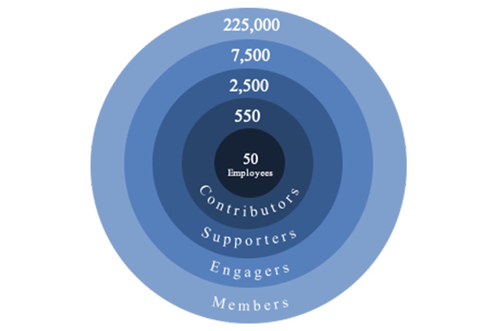
illustration made by Umbraco HQ
The moment I saw the slide I thought to myself "Yes! That's what we're doing at 24days In Umbraco CMS - The annual Umbraco advent calendar! We're expanding the circle!" - In the beginning we had a tendency to ask the same familiar faces within the community if they would like to write for us - That changed when Erica Quessenberry and Team Skrift published the article "How Diverse Umbraco Community Involvement Can Lead to Greater Success Both Personally & Professionally" in 2015 and Erica gave a talk at CodeGarden 16 called "Belonging: Building an Inclusive Community". This made us realize we needed to put in some more effort ensuring a more diverse author lineup. Therefore we're keeping an open eye out for new names when they popup in the community. We love to have some of the old timers write articles for us as well but we've become much better at expanding the circle including community newcomers into the circle, which is very much in line with the Umbraco spirit. It's not uncommon to see people who wrote for either Skrift or a 24days do a talk at the following CodeGarden 😉
Currently the circle lacks the ramp! This is why a group of community members established the accessibility team early 2019 since our favourite CMS needs some TLC (Tender, love, and care) in terms of accessibility expanding the circle for people (Be it content editors or developers) dealing with different types of disabilities. I hope my article will motivate you in our quest of helping Umbraco HQ improving the backoffice accessibility 😃
Umbraco HQ focus a lot on the editor experience in the backoffice and are carefully considering how the UX and usability can be improved always trying to improve. We have seen many cool and great improvements since the release of Umbraco 7.0.0. Umbraco is in many aspects very friendly towards editors - Not perfect, but friendly, which I think is key and why so many of use love it so much! The friendliness of the backoffice towards editors heavily depend on how you as an Umbraco professional design and implement the building blocks that editors will need for building their site.
Lack of accessibility (Generally speaking) is hidden for many people except those who rely on alternative ways of navigating and working with Umbraco such as using screen readers or keyboard only navigation. People who suffer from temporary disabilities like shoulder pain due to mouse injuries might not realize that there are issues before they're forced to use keyboard navigation for instance. People with permanent disabilities will constantly face some obstacles when accessibility has not been thought about excluding them from contributing and doing meaningful work.
This is what inspired me to write this article since improving the accessibility of the backoffice goes hand in hand with the mantra of friendliness and improve the UX and usability for all of us.
The paradigm Shift - Codename "Belle"
I recall having a chat with Shannon Deminick at the Umbraco retreat before CodeGarden 2011 about how frontend developers could contribute to the Umbraco core project. At the time the backoffice was based on webforms so as a frontend developer that cares about having full control of the HTML output it was not easy to contribute. Personally I was new to the concept of Mercurial, which the source code had just moved to from TFS/SVN in 2010. I felt the barrier to contribute was quite high.
When Umbraco 7 (Known as "Belle") saw the day of light featuring a shiny new backoffice and the source code moved to GitHub it was another story! Not that I picked up contributing straight away though. I'm not sure why, maybe I felt I did not have the skillset for it being an imposter. After all it was based on this new JavaScript framework called "AngularJS", which has served us well the past 6 years. You can tell that much work and effort was put into the process. It was a really big and successful backoffice refactor that set a new standard for the backoffice experience, which has only improved even further throughout the years. Of course there have been bugs and issues along the way but that's all part of the process I think 😄
Using a framework like AngularJS making any element clickable only requires adding the ng-click directive and hook it up with a function to run when the click event occurs. This way of setting up click handler is not a new concept. Many of us have been doing this using onlick attributes before we learned about separation of concerns and started adding event handlers externally. Using an attribute means that when you're in a hurry and need to complete a task you might not think too deeply about whether you're attaching the click event to the proper tag/element since that shiny new feature is clickable and works even though the you used a <div> instead of a <button>.
When you focus on the visual outcome it's easy to forget about adding text alternatives whenever an icon is used to visually simplify the user interface. This is not something unique in the Umbraco codebase but something you will see a lot out in the wild as well. Once you're done reading I hope you feel enlightened and realize how some relatively small details in the way you write your code can have a positive impact on accessibility.
Semantics - Using the better tag/element for the job
Accessibility is a much broader area than I will be able to cover in this article but bringing attention to fixing some of the patterns is a good starting point for improving the accessibility of Umbraco. The advice I'm giving can be used with some modifications in your everyday projects. I will be describing things in context of the Umbraco source code and the fact that Umbraco is a web app, not a website.
If you dig around in the code you will see examples of <a>, <div> and <button> tags having the ng-click directive attached.
Example 1 - Using the a non-interactive element/tag
<div
    ng-click="configureTemplate(template)"
    class="preview-rows layout"
    style="margin-top: 5px; margin-bottom: 20px; float:left">
    ...
 </div>
Lines 14-25 in grid.prevalues.html
In the above example (Wrapped content omitted) the ng-click directive is attached to the non-interactive tag/element <div> but it could have been any non-interactive element like <span>,<li>, <p> etc.
Attaching the ng-click directive to non-interactive tags/elements does not make sense since it's unreachable using keyboard navigation and screen readers will not be able to recognize and announce them either. In order to make non-interactive elements keyboard and screen reader accessible you need to add tabindex, role and aria-pressed attributes and manage whether the element should have focus and whether it's pressed or not. That's a lot of extra work for something that is baked into the <a> or <button> tags/elements. Learn more about using the role="button" at MDN.
Example 2 - Using the <a> tag without the href attribute
<a
    class="umb-nested-content__icon umb-nested-content__icon--delete"
    localize="title"
    title="general_delete"
    ng-class="{ 'umb-nested-content__icon--disabled': $parent.nodes.length <= $parent.minItems }"
    ng-click="$parent.requestDeleteNode($index); $event.stopPropagation();" prevent-default>
    <i class="icon icon-trash"></i>
</a>
Lines 21-23 in the nested-content.html file
The above code example is a snippet from the "Nested content" datatype that represents the "delete" function. If you look carefully you will notice that the href attribute is omitted. This means the feature is not keyboard and screen reader accessible. It's only possible to delete a nested content item by using a click device like a mouse or a trackpad. Wait a minute... <a> tags are usually keyboard accessible... no? Indeed they are - But when the href attribute is omitted it acts like a placeholder awaiting the href to be added at some point. Without the href this example will not be keyboard accessible since it will not be focusable. Some screen readers might announce the link as being clickable depending on how things are paired but I have not been able to have the NVDA Screen reader (Screen reader for Windows) announce it myself. It's misleading to have it announced as a link since it executes a function that removes a nested content item.
Example 3 - Using the <a> tag with the href attribute
<a data-element="button-group-toggle"
    href="#"
    prevent-default
    class="btn btn-{{buttonStyle}} dropdown-toggle umb-button-group__toggle umb-button--{{size}}"
    ng-if="subButtons.length > 0"
    ng-click="toggleDropdown()">
    <span class="caret"></span>
</a>
Lines 19-26 in umb-button-group.html
The above example is using the href attribute so everything is good, right? Well... not quite. It will be reachable by keyboard and screen readers will announce it. But most screen readers will announce "link", which does not make sense since the link is not pointing to anything. There is no meaningful text alternative for the screen reader to announce either.
You will see many examples like the above where the href attribute is either empty or pointing to "#". Whenever that is the case please feel free to do a pull request where you refactor it to a <button> 😉 - Changing the <a>tag/element to a <button> will most likely require a bit more work to handle the styling. Usually removing the default border, setting the background color and padding is what needs to be fixed in my experience.
It may sound like I'm saying "Don't ever use the <a> tag/element!" - You should of course use it when you're actually linking to either a page or a section within the backoffice. But when you do then you should use the ng-href directive, which is specific for AngularJS. For instance the content tree is build using it and in that case it's how it should be done. What I'm trying to uncover is that there are many places where <a> is most likely used because it's an interactive element. Semantically and accessibility wise that's not a good idea though. This is why we need to fix it to improve the overall accessibility 😃
Example 4 - Using the <button>tag
<button
  class="umb-action-link btn-reset umb-outline"
  prevent-default
  umb-auto-focus
  ng-if="$index === 0">
  <i class="icon icon-{{action.cssclass}}"></i>
  <span class="menu-label">{{action.name}}</span>
</button>
Lines 9-12 in umb-contextmenu-html
While the above example is better for accessibility and has better semantics since it's a <button> tag/element I have two small issues with it. It's not something that matters accessibility wise but just some pet peeves on my behalf 😉
First off - You might have noticed the button has the class names umb-action-link and btn-reset. I prefer to use the more generic class name "action" since clicking on a link triggers an action to go to another page or section and clicking a button triggers some kind of functionality like opening an overlay. Usually you will need to use one or the other depending on the context and then I find it weird to add a class name that contains the word "link" to a <button> tag/element or a class name that contains "btn" on a <a> tag/element to make things look correct. I hope that we can agree on using "action" or some other similar variant of class names in future builds separating the concerns of behavior and layout, which will make it easier to define the base look and feel of the "action" avoiding the need to deal with styling when the element is changed from one to another. I know this is opinionated - I would just love it if we could agree on one common name that is more meaningful than either "link" or "btn" to use and use modifiers when necessary 😃
Secondly there is a directive called prevent-default being used in the example. It's created by Umbraco HQ as a custom directive and as the name implies it's intended to declaratively disable the default behavior of the element it's being used on. Typically it will prevent the default click event on a <a> tag/element. I don't have a problem with the directive - It's a good way of disabling the default behavior.
But when using a button it's not needed since using type="button" will do the same out of the box because it tells the <button> element to be a button, which will not have any defaults. I advice to set type="button"specifically since the type attribute will work differently depending on context. If it's placed inside a <form> the <button> will implicitly be a submit button triggering a form submission. It can be hard to figure out when we're inside a <form> context due to the concept of transclusion. For this reason it's a good idea to explicitly use type="button" since we can otherwise risk triggering a form submission instead of an overlay for instance. The benefit is that we don't need to use the prevent-default directive, which is merely used to prevent the default action of the <a> tag. If you're certain you want to submit a form the type attribute can be omitted.
Example 5 - A cleaner <button> example
<button
    type="button"
    class="umb-action-link btn-reset umb-outline"
    umb-auto-focus ng-if="$index === 0">
    <i class="icon icon-{{action.cssclass}}"></i>
    <span class="menu-label">{{action.name}}</span>
</button>
In the above example I removed the prevent-default directive and added a type="button" attribute instead. Even though we have improved the semantics using a <button> tag/element there is still room for improvement providing a proper text alternative to the used icon in a non-visual context.
Text alternatives for a non-visual context
Throughout the code there is a pattern of using the <i> element to insert icons using classes like icon icon-user. Usually no text alternative is provided. The icon supports the visual context but the lack of a text alternative for non-visual context mean that screen readers will not announce anything, which makes it confusing to figure out the context if you can't see the visuals. There is a chance that the screen reader will try to announce the referenced icon, which might not make any sense at all.
Sometimes other elements will be used for displaying icons. Most commonly the <span>element with a class of caret will be used in some occasions. However the point and concept about providing text alternatives for a non-visual context remain the same. Whenever any kind of empty element is used for displaying an icon it's a good idea to add the aria-hidden attribute with a value of true since this will make the screen reader ignore the element not trying to announce it.
Caution: When using the aria-hidden attribute make sure you provide a proper non-visual context for screen readers to announce instead - If no text alternative is provided screen reader users are left in the dark
In order to improve the non-visual context a meaningful text alternative must be added. I'm sure that there are more ways of doing this but I'm going to mention the two approaches that I tend to use myself using either the .sr-only class or the aria-label attribute.
Text alternative using the class="sr-only on a <span>
<button
  type="button"
  class="umb-action-link btn-reset umb-outline"
  umb-auto-focus
  ng-if="$index === 0">
  <i class="icon icon-{{action.cssclass}}" aria-hidden="true"></i>
  <span class="sr-only"><localize key="visuallyHiddenTexts_jumpTo">Jump to </localize></span>
  <span class="menu-label">{{action.name}}</span>
</button>
In the above example I'm using a <span> element with class="sr-only" containing the "Jump to" text, which will be visually hidden but make screen readers announce "Jump to Culture and Hostname" assuming the computed value of {{action.name}} will be "Culture and Hostname". This provides a more meaningful non-visual context hinting what clicking the button will do.
The .sr-only class ensures that the text is exposed to the accessibility API, which means a screen reader will be able to announce it. Furthermore it ensures the text does not impact the visual experience. It's a special class that must be used to hide non-visual texts properly. If you wonder why we're not using display: none or visibility: hidden I don't blame you. Doing so will remove the element from the DOM and therefore it will not be exposed to the accessibility API, which means it's not available for screen readers. Setting opacity: 0 will work in the sense that the element is still in the DOM but even though the element is not visible it's dimensions will remain making things look weird visually. In other projects you're working on you have perhaps noticed a class called .visuallyhidden, which will do the same thing. In the Umbraco source code it's called sr-only. 😃
Please notice that I have also hidden the <i>element from screen readers using the aria-hidden="true" ensuring the element is not exposed to the accessibility API.
The "visuallyHiddenTexts" is a new area that has been added to language files the Umbraco source code recently. It's the intention to group non-visual texts so it's easier to maintain and avoid confusion about what the intentional use of the different text bits are.
The accessibility API
Whenever I mention screen readers it's important to know that screen readers and other assistive technologies don't read the DOM of the website or web application directly. All the relevant roles, attributes and texts from the DOM are consumed by the accessibility API that makes the relevant information available for assistive technologies. Our job is to ensure that the relevant information is available for the API. The accessibility API is not specific for web browser software but is used for exposing information in the operating system to assistive technologies and other installed software as well. Léonie Watson explains the details in her article "Accessibility APIs: A Key To Web Accessibility"
Text alternative using the aria-label attribute on a <button>
<button
    type="button"
    class="umb-action-link btn-reset umb-outline"
    aria-label="Jump to {{action.name}}"
    umb-auto-focus ng-if="$index === 0">
    <i class="icon icon-{{action.cssclass}}" aria-hidden="true"></i>
    <span class="menu-label">{{action.name}}</span>
</button>
In this example screen readers will announce the text in the aria-label attribute, which will for instance be "Jump to Culture and Hostnames". Visually we will see "Culture and Hostnames". aria-label will take precedence and overrule any text that might be wrapped in the <button> element.
I recommend using the <span class="sr-only">...</span> approach in most cases since the <localize> directive (From the Umbraco code base) does not support concatenating a language key with a computed text. I thought it would be nice to mention that there is another way if you're in a scenario where the .sr-only approach won't cut it and it could make sense to take this approach instead.
Hopefully it's clear by now that it does not take too much effort to improve the backoffice accessibility by making a few adjustments to the patterns we use when we're creating different kinds of actions. Things to think about:
- Does this reference another section or another page? If so then use a <a> otherwise use a <button>
- Make sure to hide icon references for screen readers by adding aria-hidden="true"
- Make sure to provide text alternatives for non-visual context using the .sr-onlyclass on the tag/element containing the text
Doing this will increase the accessibility of the backoffice including more people enabling them to work with the backoffice in the way they able to. In the words of Léonie Watson from her blogpost "The difference between keyboard and screen reader navigation"
Without well-formed HTML that uses the appropriate element for the purpose, screen reader navigation breaks down completely, and keyboard navigation is at a high risk of doing the same.
This quote is backed by Florian Beijers who recently started as a web developer at the Umbraco powerhouse known as Perplex in The Netherlands. Florian is blind and therefore uses a screen reader supported by a Braille display in his everyday. He is allowed company time contributing to improving Umbraco's accessibility and he decided to follow the basic website tutorial - It's an eye opening read with some good insights about the obstacles he is facing trying to create document types, setting up templates etc. following the tutorial. In the notes he mentions the lack of text alternatives in some scenarios, which makes it hard for him to figure out what a button will actually do when it's clicked.
His experience also shows that we need to fix some issues within the documentation since some of the steps are out of sync and some images lack useful alt attributes describing some of the important things displayed textually in the image.
Font icons and the <i> tag/element
The current icon approach is based on adding icons to a font-file. Around the time where Umbraco 7 was new and shiny in 2013 this was state of the art since it was brilliant for performance. Unfortunately it's bad for accessibility - Seren Davies who is dyslexic explains the downsides of icon fonts in her talk "Death to icon fonts". The double Umbraco award winning 🏆 Mike Masey has created a pull request switching the use of font icons into using SVG's instead, which provides for better accessibility and maybe better performance. The research I was able to find did not pick a clear winner. The pull request will introduce a new <umb-icon> component and is currently awaiting HQ review.
Furthermore the <i> element is meant for providing semantic context. For many years we have been used to inline elements like <b> and <i> not having any semantic meaning but only being used for stylistic purposes. That all changed with the HTML5 specification. Now both have a deeper semantic meaning and usage and the <i> tag/element should be used like mentioned in the quote from Aaron Gustafson's article "Conversational semantics"
The <i> element is similar to the emphasis element, but more generic. It is used to indicate an alternate voice or mood. It could be used to indicate sarcasm, idiomatic remarks, and shifts in language.
Clicking the <button>
When clicking a <button> in the backoffice it will usually either trigger a dialog (modal/overlay), submit a form or bring a context menu into view.
In order to give screen reader users a hint about what type of "event/action" that will happen we can use the following aria attributes:
- aria-haspopup
- aria-expanded
Depending on what is triggered we need to use them differently. The aria-expanded attribute accepts a boolean of either true or false revealing whether what the click triggered is coming into view or not.
aria-haspopup has recently changed with the ARIA 1.1 specification so it can now accept different values. Among those values are true and dialog. Instead of using true we could resort to using menu but either of them will indicate that a menu will "pop up" and since menu and dialog are recently added to the spec screen reader support for these values may vary. Therefore it's better to use aria-haspopup="true" for now.
Triggering a context menu
In the backoffice we have some context menus we can open. They will allow editors to perform some actions. There is a "Actions" menu that will let editors "Move", "Copy" or "Delete a node etc. and there is a "Publishing" menu, which will allow us to "Schedule publishing", "Publish with descendants" or "Unpublish" a node.
Actions menu
Publishing options menu

In order to expose this to screen readers and letting them know whether the menu is active/visible we need to use a combination of aria-haspopup and aria-expanded, like in the code example below
<button
    ng-if="vm.type === 'button'"
    type="button"
    class="btn umb-button__button {{vm.style}} umb-button--{{vm.size}}"
    ng-click="vm.clickButton($event)"
    hotkey="{{vm.shortcut}}"
    hotkey-when-hidden="{{vm.shortcutWhenHidden}}"
    ng-disabled="vm.disabled"
    umb-auto-focus="{{vm.autoFocus && !vm.disabled ? 'true' : 'false'}}"
    aria-haspopup="{{vm.hasPopup}}"
    aria-expanded="{{vm.isExpanded}}"
    >
    <span class="umb-button__content" ng-class="{'-hidden': vm.innerState !== 'init'}">
        <i ng-if="vm.icon" class="{{vm.icon}} umb-button__icon" aria-hidden="true"></i>
        {{vm.buttonLabel}}
        <span ng-if="vm.showCaret" class="umb-button__caret caret" aria-hidden="true"></span>
    </span>
</button>
In the above example the computed value of aria-haspopup="{{{vm.hasPopup}}" will be true since that is the value passed where the directive is being used for the action. The value for aria-expanded="{{vm.isExpanded}}" will start out being false until the <button> is clicked it will be true and once the menu is closed or tabbed out of it will be set back to false.
This is how to let screen readers know that there is a menu and whether it's "in view" or not. There is more to the subject of defining the menu but that is beyond the scope of this article. Instead I recommend you read the article "Menus & Menu Buttons" by Heydon Pickering.
Triggering a dialog (modal/overlay)
Currently using aria-haspopup="dialog" will make screen readers announce "...menu button submenu", so if the button text is "Open modal" it will announce "Open modal menu button submenu", which is not what we would expect when a value of dialog is set. At least this is true for NVDA, which I'm using. Other screen readers might act differently but until support is more widespread it's better to avoid using the value.
I had a chat with Florian about how we can provide better ways of indicating that a <button> triggers a dialog. I learned that Umbraco HQ with the release of Umbraco 8 already got this scenario covered by using an ellipsis after the action name. If you have used Umbraco 8 you have probably noticed this when opening either the "Actions" menu or the publishing options in the "Content" section for instance. When you do, it will read something like "Create...", "Move..." etc. - I must admit that I have been a bit confused about why this was added as I think that it looks a bit weird visually. Now I'm wiser! 💡
However in some contexts it's OK to visually hide the ellipsis, as illustrated in the code example below.
<button
    type="button"
    class="umb-node-preview__action umb-node-preview__action--red"
    title="Remove {{name}}"
    ng-if="allowRemove && !removeUrl"
    ng-click="onRemove()">
    <localize key="general_remove">Remove</localize>
    <span class="sr-only">{{name}}...</span>
</button>
The remove button from the above code example 
Florian did mention that it might be even better to have a text like "(Open dialog)" instead of the ellipsis. It's a convention used in other contexts (Not widely used on the web though) so we agreed to stick with the ellipsis approach since the "(Open dialog)" text will need to be translated for the many different languages Umbraco supports. Florian stressed that it's important that the ellipsis is not made using icons/graphics but is pure text.
As mentioned this approach and convention was unknown to me so I actually made a pull request where I had hidden the ellipsis from screen readers...Instead of assuming I knew better I should have asked HQ why the ellipsis was there in the first place. I think that calls for a "High five I suck" 🤦♂ - The mistake has been fixed though 😉
Don't remove the focus indicator!
For visual context it's important to mention that there must be a focus state for the button, which by default is the "focus-ring" that many designers usually do not like. Without a clear focus indicator a user relying on keyboard navigation will not have any visual clue about what is being focused. Luckily this has not been overwritten in the backoffice so unless a specific focus styling has been set using CSS the default browser focus ring will be used.
What about tabindex?
If you wonder why I have not mentioned anything about the tabindex attribute it's mostly because elements are conditionally available in the DOM depending on whether the ng-if directive has a true or false value. If the value is false then the HTML is not available in the DOM and therefore we don't need to think about dealing with tabindex in most scenarios.
There is much more to it...
I have only scratched the surface. There are many improvements that can be made but I'm not able to describe them all since this article has become very long already. Maybe I should consider writing a book instead? 🤔😉
Focusing on using the proper semantics and providing text alternatives for non-visual contexts is a really good starting point. It builds a good foundation for the continued work and effort on improving the accessibility of our beloved CMS making it even more inclusive and FRIENDLY creating a broader appeal and reach - Or expanding the circle so to speak 😉
The following areas / subjects are things that needs to be considered as well - Listed randomly as they came to mind. I have probably forgotten some 😅
- Focus lock for open dialogs - Make sure that keyboard focus remains in the open dialog. There is a proof of concept pull request awaiting HQ feedback for this already
- Use proper dialog markup for modals/overlays so screen readers will announce them
- Ensuring that focus is being set on the element that opened a dialog once it's being closed (Related to the focus lock PR mentioned above)
- Better color contrasts - Visually it can currently be hard to distinguish when certain elements have hover/focus on them. It's a big subject and perhaps providing a high contrast theme is the best way to go since I believe there should still be room for creative freedom even though I'm personally red/green color blind for instance. A little higher contrast ratio in certain areas will not break the design either though.
- Use aria-live for notifications so screen readers will announce them when a node is published for instance. Currently screen reader users will not be aware
- Better Form validation, which will involve the use of a mix of ARIA attributes. Perhaps using the ngAria will improve this out of the box
- Skip links - Making it possible to quickly jump to sections of interests using keyboard navigation
- The ability to zoom the backoffice without breaking it
- Clear focus states - There are still some areas where this needs to be improved
- Respect the "Prefers reduced motion" media query - If one has epilepsy or don't like animations this media query can be used to respect that
- Content tree navigation - Confusing to figure out what level you're at and how you navigate back and forth (Using keyboard and screen readers)
- Better text alternatives for a non-visual context
- "DO SOMETHING ELSE" needs to renamed in both visual and non-visual contexts 😃
At the time of writing 40 of 160+ issues reported have been merged into core. Furthermore 5 are are awaiting HQ review, 10 are currently in progress and 105 issues are open. I think that calls for a big round "High five you rock!" to each and everyone who has contributed 🙌
The ngAria module
Since I'm no AngularJS expert I was unaware that there actually is a ngAria module that will do some heavy lifting setting ARIA attributes automatically when certain AngularJS core directives are used. I realized this watching Marcy Sutton's talk "AngularJS accessibility" - It's my understand that it's more or less "Plug'n'Play" - Maybe it will conflict with some of the accessibility improvements that have been added "manually". For instance I noticed that some have added aria-required whenever the ng-required directive is used. When using the "ngAria" module this should be handled automatically. It's definitely worth exploring since it may be able to ease the burden of improving some areas 😃
Future of the Umbraco frontend
"Why put so much effort into improving backoffice accessibility as long as the underlying framework is running on an outdated version of AngularJS - Why not wait to work starts on v9?" you might be wondering. Personally I think it makes good sense to start now since I don't believe it matters whether it's an old or new framework that is being used. We can still improve what we currently have rather than feeling frustrated that it's not the latest and greatest tech under the hood. The important thing is to improve the backoffice experience for all of us and the sooner we start trying the sooner we will learn some valuable lessons about how things can be done better once it's time to start working on Umbraco 9.
By that time accessibility will hopefully be thought of up front instead of being retrofitted. I'm certain we will run into issues for improving certain areas in Umbraco 8 where it might not be possible to solve issues in the best way or at all due to the current architecture. The good thing is that we will then be aware of those issues before work on Umbraco 9 starts. Even though we're hopefully much more aware about how to deal with accessibility in Umbraco 9 I'm certain we will still face some challenges. What matters most is that Umbraco HQ and all the lovely contributors are more aware and have and have an accessibility mindset so we can progressively evolve the backoffice over time figuring out some solid solutions and concepts. Accessibility is framework agnostic and whether we're using framework X or Y the concepts for ensuring the use of proper semantics remain the same.
The sooner we get the different components right it's easier to ensure the accessibility throughout the codebase. Currently many buttons are being used without using the existing <umb-button> component. Many places in the codebase would benefit from a refactor to use this component since that will keep the semantics for dealing with the proper elements and providing text alternatives centralized making it simpler to avoid unawarely introducing accessibility issues. Define once use everywhere... or something like that - You catch my drift 😄 This thinking can be applied to many areas and already is - But being an open source project focusing in having as many contributors as possible not everyone will be aware that there is a component that can deal with the heavy lifting for them when they want to contribute a new feature or what they have in mind and that is OK. I don't intend to enforce a lot of rules and regulations on everyone - My hope is to enlighten people and help them make better decisions when they implement new features and seek accessibility advice up front.
I don't have any clue about the lifespan for Umbraco 8 and when Umbraco 9 will see the day of light or even what frontend framework will be used. What I do know is that Umbraco 8 will be around for many years to come. Umbraco 7 will be supported on cloud until September 30th 2023, which means it will have had a lifespan of 10 years by then and for on premise projects hosted outside of Umbraco cloud it will live for many more years to come as well. (Many of you still happen to work on v4 and v6 projects, right? 😉)
What I do know is that active development on AngularJS stopped in June 2018 but I want to illustrate that Umbraco 8 will probably live for a longer period of time. So we might as well embrace it now and do all the improvements that we possibly can. While AngularJS LTS (Long term support) ends June 2021 that is of course frustrating because there are other more interesting frameworks out there. But it's not like we can't use it anymore past that point. It's outdated indeed, so is jQuery but believe it or not it's still being used many places out in the wild too. Of course critical issues can arise etc. I guess my point is that instead of nagging about old tech we might as well embrace it and make the best of it preparing for the future and getting a clear idea about the components we need and how they should function catering for optimal accessibility. Let's not forget that AngularJS has served us pretty well the past years and nagging about "That hopelessly outdated framework" will bring us nowhere. We're better of spending our energy making the best of it so we can do even better in terms of accessibly in the future 😃
In my world developer experience is less important than the end user experience. The end user will not care about what technology is the foundation of the website, web app or software that they're using. They care about having a good experience.
Conclusion
I have not mentioned WCAG 2.1 anywhere in the article. That is because I wanted to take a "hands-on" approach and other articles have covered the ins and outs of the guidelines very well.
I hope you feel enlightened that semantics matter since it has a big impact on accessibility and make the difference between creating an inclusive and accessible experience. To me the concept of being inclusive goes hand in hand with being friendly and having empathy for one another. Carole Rennie Logan did a great talk about "Empathy in tech" during CodeGarden 2019 and while it's not directly related to accessibility I think it's relevant in terms of accepting that we don't all use apps and websites in the same fashion, which is important to keep in mind.
If you want to help out improving the accessibility of the Umbraco backoffice then what better occasion than during the month of October where the Hacktober event takes place? If you do 5 approved pull requests before the end of the month you will receive Hacktober swag from Digital Ocean and Umbraco HQ will send you some nice swag as well. You can find some issues to work on at the Umbraco accessibility issues Trello board or maybe you have found some accessibility issues on your own that is not on the list. Please feel free to do a pull request for them 🙏 💪 - Personally I will be present at the Umbraco UK Hackathon the day before Umbraco UK fest and I'll be happy to assist you! 🙌
Improving the accessibility of the frontend components will hopefully result in third party packages having improved accessibility as well if they're using some of the core components - Improving accessibility without even being aware perhaps. That's a win! I know that there is more to it but when Umbraco HQ lead by example it's easier for people in the contributor circle to follow along 😃
Better accessibility in the Umbraco backoffice will help us expand the circle and include more people into our wonderful community embracing our differences supporting the vision of being FRIENDLY! Making the backoffice experience better for all of us 😃
Apart from being FRIENDLY there are some very good reasons to care about accessibility from a business point of view since it's sometimes requested in proposals that authoring tools such as CMS's need to comply with the ATAG specification - In short it means that the authoring tool must be accessible and support editors creating accessible content too. By improving accessibility ensuring Umbraco complies to the WCAG 2.1 specification we help Umbraco having a competitive advantage over some of the competitors when companies select CMS's. In the end we help increase the odds that we will create more Umbraco related work for ourselves as well... I hope! 😉
Happy Umbraco accessible Hacktober everyone! 🎉 🎊
PS: A big "High 5 you rock!" 🙌 and thank you to those to my reviewers of this article who provided some very valuable feedback - You know who you are ❤️
Resources
The following resources are supplement to those referenced directly in the article and are a selection of some books, blogs and websites I have found very useful throughout the years.
Books
- Laura Kalbag - Accessibility for everyone
- Heydon Pickering - Inclusive design patterns
- Heydon Pickering - Inclusive Components
Blogs and websites
- Léonie Watson - https://tink.uk/
- Sara Soueidan - https://www.sarasoueidan.com/tags/accessibility/
- Ire Aderinokun - https://bitsofco.de/tag/accessibility/
- Marcy Sutton - https://marcysutton.com/writing/
- Mina Markham - https://medium.com/@minamarkham
- Lindsey Kopacz - https://www.a11ywithlindsey.com/
- Scott O'hara - https://www.scottohara.me/
- Hidde de Vries - https://hiddedevries.nl/en/blog/
- Adrian Roselli - http://adrianroselli.com/tag/accessibility
- https://a11yproject.com/
- Accessibility people on Twitter
- Building the most inaccessible site possible with a perfect lighthouse score