
With Umbraco 13 reaching the end of its support lifecycle on 14th December 2026, many developers will be in the middle of upgrading their projects to the latest long-term support release, Umbraco 17. If you've started migrating your codebase, you've probably discovered that dashboards aren't quite as simple to carry across as you might have hoped.
That's because, from Umbraco 14 onwards, the backoffice was completely rebuilt as part of Project Bellissima. The old AngularJS-based dashboards are no longer supported, meaning they need to be rewritten using the new extension architecture. While that might sound like a daunting task, it's also an opportunity to modernise your dashboards using TypeScript, Lit and the wider modern JavaScript ecosystem.
In this tutorial, we'll build a simple Umbraco 17 dashboard from the ground up using Vite. Starting with a new Vite project, we'll configure it to work with Umbraco before creating a dashboard that displays data in a table. By the end, you'll have a solid foundation for building your own dashboards and a better understanding of the new development workflow, making the move to the modern Umbraco backoffice a little less intimidating.
Prerequisites
For this tutorial, I'll be using a clean installation of Umbraco v17.3.1. Starting with a fresh project keeps the focus on building the dashboard itself rather than project setup or migration. It also means we're all working from the same starting point and avoids any migration-specific issues that you might encounter in an existing project.
You'll also need a recent LTS version of Node.js (I'm using v24.14.1), along with npm, which is installed as part of Node.js.
I'll assume you have a basic understanding of modern JavaScript development, so I won't be covering TypeScript syntax or the fundamentals of JavaScript frameworks in detail. Instead, we'll concentrate on how everything fits together within an Umbraco dashboard.
To keep the example practical, we'll create a simple C# API endpoint that returns some sample data. We'll then consume that data from our dashboard and display it in a table. We'll also update the dashboard tree so that multiple nodes can be used to display different sets of data, giving you a solid foundation to build on in your own projects.
Creating an Umbraco dashboard
To make this tutorial worthwhile, we will create a dashboard that feels a little more like a real-world dashboard, rather than a simple "Hello World" example. We will create a dashboard and make it visible within Umbraco and flesh it out by adding a table of data that is driven by the content tree nodes. For this tutorial, the content nodes will be hardcoded but you can expand on this by pulling data from an API endpoint instead.
Vite Project Setup
To keep everything self-contained, create an App_Plugins folder in your website project if you don't already have one. Inside that, create another folder called ViteDashboard.
With the folder structure in place, open a command prompt in the ViteDashboard directory and run the following command to create a new Vite project.
npm create vite@latest Vite.UmbracoDashboard
Follow the prompts to choose your package name, selecting Lit as the framework and TypeScript as the variant. Vite will then scaffold the project inside your ViteDashboard folder.
If you're using Visual Studio, don't forget to include the newly created files and folders in your project so they're tracked correctly.
With the project created, we next need to install the Umbraco backoffice package. It's important that the package version matches the version of Umbraco you're targeting, otherwise you may run into compatibility issues. For this tutorial, I'm using Umbraco 17.3.1, so I'll install the matching backoffice package using the following command.
npm i && npm install -D @umbraco-cms/backoffice@17.3.1
Once the project has been created, we can remove the default files that Vite has generated for us. These are useful when creating a standard frontend application, but for our Umbraco dashboard they aren’t needed.
Go ahead and delete everything inside both the public and src folders. We’ll be replacing these with the files required for our dashboard extension.
Creating the Vite configuration file
Before we can build our project, we need to tell Vite how we want that build process to behave. This is where we define things such as the output location for our compiled files, which is especially important when working with Umbraco as the generated files need to end up in a location that the backoffice can discover.
Create a new file called vite.config.ts inside your Vite.UmbracoDashboard folder.
Within this file, the outDir setting is particularly important. This needs to point to the App_Plugins folder inside the wwwroot directory of your Umbraco 17 project, as this is where Umbraco expects to find backoffice extensions.
/vite.config.ts
import { defineConfig } from "vite";

export default defineConfig({
    build: {
        lib: {
            entry: "src/index.ts",
            formats: ["es"]
        },
        outDir: "../../../wwwroot/App_Plugins/ViteDashboard",
        emptyOutDir: true,
        sourcemap: true,
        rollupOptions: {
            external: [/^@umbraco/]
        },
    },
    base: "/App_Plugins/Client/"
});
We are now ready to move onto our dashboard.
Creating Menu Items
Before we get started, there is a small amount of configuration required before our dashboard will appear in Umbraco. For this, we need to create both a menu item and a section view.
The reason for this is that a dashboard section view needs to have an associated menu item in order for Umbraco to register and display it correctly within the backoffice.
Inside your src folder, create a new folder called section and then add two additional folders named menu and sectionView.
Your folder structure should now match the example below:
src/
├── section/
	├── menu/
	├── sectionView/
Under the menu folder, create a new file called menu-item.ts and add the following content to it.
src/section/menu/menu-item.ts
import { html, customElement, state } from '@umbraco-cms/backoffice/external/lit';
import type { TemplateResult } from '@umbraco-cms/backoffice/external/lit';
import { UmbLitElement } from '@umbraco-cms/backoffice/lit-element';

const elementName = 'dashboard-menu-items';

@customElement(elementName)
class DashboardMenuItems extends UmbLitElement {
    // Variables for managing the active menu item
    @state()
    private activeMenuItem?: string | null;

    private readonly popStateHandler = () => {
        this.activeMenuItem = this.getActiveMenuItem();
    };

    constructor() {
        super();
    }

    // Initialises the menu items and gets the active menu item
    connectedCallback() {
        super.connectedCallback();
        this.activeMenuItem = this.getActiveMenuItem();
        window.addEventListener("popstate", this.popStateHandler);
    }

    // Disposes of the event listener
    disconnectedCallback() {
        window.removeEventListener("popstate", this.popStateHandler);
        super.disconnectedCallback();
    }

    // Gets the active menu item from the URL params, sets a default to Fruit
    private getActiveMenuItem(): string | null {
        var param = new URLSearchParams(window.location.search).get("group");

        if (param == null) {
            return "Fruit"
        }
        else {
            return param;
        }
    }

    // Sets the active menu item
    private navigateToMenuItem(group: string) {
        this.activeMenuItem = group;
        window.history.pushState({}, "", `section/food-groups?group=${encodeURIComponent(group)}`);
        window.dispatchEvent(new PopStateEvent("popstate"));
    }

    // Renders two menu items, this is hard coded but could be dynamic
    renderItems(): TemplateResult {
        return html`<uui-menu><uui-menu-item ?active=${this.activeMenuItem === "Fruit"} @click=${() => this.navigateToMenuItem("Fruit")} label="Fruit"><uui-icon slot="icon" name="icon-database"></uui-icon></uui-menu-item></uui-menu>
        <uui-menu><uui-menu-item ?active=${this.activeMenuItem === "Vegetable"} @click=${() => this.navigateToMenuItem("Vegetable")} label="Vegetable"><uui-icon slot="icon" name="icon-database"></uui-icon></uui-menu-item></uui-menu>`;
    }

    render() {
        return html`${this.renderItems()}`;
    }
}

export { DashboardMenuItems as element };

declare global {
    interface HTMLElementTagNameMap {
        [elementName]: DashboardMenuItems;
    }
}
This TypeScript file creates the menu items that will appear in the tree within our dashboard section. In this example, we are creating two menu items: Fruit and Vegetable. When a user selects one of these items, we can use the section view to display different data depending on the selection.
This approach could be taken a step further by creating menu items dynamically. I have used this pattern before when building a custom dashboard for Umbraco Forms, where each form was generated as its own menu item rather than being manually defined.
It is worth mentioning that this probably isn’t the only (or necessarily the best) way to handle switching between menu items. However, it is a simple approach that I have used a few times and it has worked well within Umbraco 17.
Next, create another file inside the menu folder called manifest.ts. This file is responsible for registering our menu items with Umbraco and making them available within the backoffice.
You can think of this file as a configuration point that describes the UI components we want Umbraco to load and how they should be wired together.
src/section/menu/manifest.ts
import { SECTION_ALIAS } from '../../section/manifest';

export const sidebarAppManifest =
{
    type: 'sectionSidebarApp',
    kind: 'menuWithEntityActions',
    alias: 'dashboardSideBarAlias',
    name: 'Dashboard Sidebar',
    meta: {
        label: "Food Groups",
        menu: 'dashboardMenuAlias'
    },
    conditions: [
        {
            alias: "Umb.Condition.SectionAlias",
            match: SECTION_ALIAS
        }
    ]
};

export const menuManifest =
{
    type: 'menu',
    alias: 'dashboardMenuAlias',
    name: 'Dashboard Menu',
};

export const menuItemManifest = {
    type: 'menuItem',
    kind: 'tree',
    alias: 'dashboardMenuItemAlias',
    name: 'Dashboard Menu Items',
    meta: {
        label: 'Food Groups',
        menus: ['dashboardMenuAlias']
    },
    defaultView: 'Dashboard.SectionView',

    element: () => import('./menu-item.ts')
};
Within this file, you can also configure the label that will appear at the top of the tree within the Umbraco backoffice. For this tutorial, we will keep things simple and call it Food Groups.
Creating a Section View
The section view is responsible for displaying the content of our dashboard. When a user clicks between the different menu items — Fruit and Vegetables in our case — the section view will be rendered again with the relevant table data.
When building anything for the Umbraco backoffice, I try to use the built-in Umbraco UI components wherever possible. This helps ensure that custom dashboards and extensions feel like a natural part of the backoffice rather than something bolted on.
A full list of the available components can be found in Umbraco's UI Library documentation.
Just like our menu item, we need to create a manifest file for the section view so that Umbraco knows it exists and how it should be loaded.
Inside the sectionView folder, create a new file called manifest.ts and add the following content:
src/section/sectionView/manifest.ts
import { SECTION_ALIAS } from '../../section/manifest';

const SECTIONVIEW_ALIAS = "Dashboard.SectionView";

export const sectionViewManifest =
{
    type: "sectionView",
    alias: SECTIONVIEW_ALIAS,
    name: "Dashboard Section View",
    element: () => import('./section-view.ts'),
    meta: {
        label: "Data",
        pathname: "data",
        icon: "icon-database"
    },
    conditions: [
        {
            alias: 'Umb.Condition.SectionAlias',
            match: SECTION_ALIAS,
        }
    ]
};
This is a fairly simple manifest file, but it serves an important purpose. It registers our section view with Umbraco and tells the backoffice which file should be loaded when rendering the view — in this case, section-view.ts.
Next, create the section-view.ts file in the same folder. This is where we will start adding the logic and markup required to render the content of our dashboard.
src/section/sectionView/section-view.ts
import { html } from 'lit';
import { customElement, state } from '@umbraco-cms/backoffice/external/lit';
import { UmbLitElement } from "@umbraco-cms/backoffice/lit-element";
import { UMB_AUTH_CONTEXT } from '@umbraco-cms/backoffice/auth';

const element = "dashboard-sectionview";

// Dashboard model that will hold our data
interface DashboardModel {
    count: number;
    foods: FoodItem[];
}

// Table rows
interface FoodItem {
    id: number;
    name: string;
    description: string;
    group: string;
}

// Fetches the data from the API to display in the table on the section view
export async function fetchFoodItems(host: any, page: number, pageSize: number, foodGroup: string): Promise<DashboardModel> {
    const authContext = await host.getContext(UMB_AUTH_CONTEXT);
    const token = await authContext?.getLatestToken();

    const response = await fetch('/umbraco/management/api/v1/DashboardApi/GetFoodItemsByGroup?page=' + page + '&pageSize=' + pageSize + '&group=' + foodGroup, {
        method: 'GET',
        headers: {
            'Authorization': 'Bearer ' + token,
            'Content-Type': 'application/json'
        },
        credentials: 'same-origin'
    });

    if (!response.ok) {
        throw new Error(`Failed to fetch food items: ${response.status}`);
    }

    return (await response.json()) as DashboardModel;
}

@customElement(element)
export class DashboardSectionView extends UmbLitElement {
    // State variables that will react to changes such as current page

    @state()
    private dashboardApiModel: DashboardModel | undefined;

    @state()
    private currentPage: number = 1;

    private pageSize: number = 10;

    private totalPages: number = 1;

    @state()
    private foodGroup: string = 'Fruit';

    private readonly popStateHandler = () => {
        this.foodGroup = new URLSearchParams(window.location.search).get("group") ?? 'Fruit';
        this.getPaginatedItems(this.currentPage);
    };

    connectedCallback() {
        super.connectedCallback();
        this.foodGroup = new URLSearchParams(window.location.search).get("group") ?? 'Fruit';
        window.addEventListener("popstate", this.popStateHandler);
        this.getPaginatedItems(this.currentPage);
    }

    disconnectedCallback() {
        window.removeEventListener("popstate", this.popStateHandler);
        super.disconnectedCallback();
    }

    // Calls fetchFoodItems and sets the dashboard model
    private getPaginatedItems(page: number): void {
        this.currentPage = page;

        fetchFoodItems(this, this.currentPage, this.pageSize, this.foodGroup).then(data => {
            this.dashboardApiModel = data;
            this.totalPages = Math.ceil(this.dashboardApiModel.count / this.pageSize);
        }).catch((err) => console.error(err));
    }

    // Gets the paginated food items
    private nextOrPrev(increment: number): void {
        this.currentPage += increment;
        this.getPaginatedItems(this.currentPage);
    }

    // Renders the pagination buttons including next/prev
    private renderPageButtons() {
        const buttons = [];
        const start = Math.floor((this.currentPage - 1) / this.pageSize) * this.pageSize + 1;
        const end = this.totalPages;

        for (let page = start; page <= end; page++) {
            buttons.push(html`<uui-button look="${this.currentPage === page ? 'primary' : 'outline'}" @click=${() => this.getPaginatedItems(page)}>${page}</uui-button>`);
        }

        return buttons;
    }

    // The main render function. This renders a simple Umbraco UI table with our food item data
    render() {
        return html`
    <div class="umb-page">
    <div class="umb-dashboard" data-element="dashboard">
    <div class="umb-dashboard__content" style="padding: 30px; max-width: calc(100% - 30px);">
      <uui-table style="padding-left: 30px; padding-top: 30px; padding-right: 0px; max-width: inherit;">
        <uui-table-head>
          <uui-table-row style="grid-template-columns: 120px 1fr 140px 100px;">
            <uui-table-head-cell>Id</uui-table-head-cell>
            <uui-table-head-cell>Name</uui-table-head-cell>
            <uui-table-head-cell>Description</uui-table-head-cell>
          </uui-table-row>
        </uui-table-head>

        <uui-table-body style="display: table-row-group;">
          ${this.dashboardApiModel?.foods.map(
            (order) => html`
              <uui-table-row style="grid-template-columns: 120px 1fr 140px 100px" clickable>
                <uui-table-cell>${order.id}</uui-table-cell>
                <uui-table-cell>${order.name}</uui-table-cell>
                <uui-table-cell>${order.description}</uui-table-cell>
              </uui-table-row>
            `
        )}
        </uui-table-body>
      </uui-table>

        <div style="display:flex; gap:6px; align-items:center; padding:16px; justify-content: center;">
        <uui-button
            look="outline"
            ?disabled=${this.currentPage === 1}
            @click=${() => this.nextOrPrev(-1)}
        >
            Prev
        </uui-button>

        ${this.renderPageButtons()}

        <uui-button
            look="outline"
            ?disabled=${this.currentPage >= this.totalPages}
            @click=${() => this.nextOrPrev(1)}
        >
            Next
        </uui-button>
        </div>
        </div></div></div>
    `;
    }
}

export default DashboardSectionView;

declare global {
    interface HTMLElementTagNameMap {
        [element]: DashboardSectionView;
    }
}
Although this looks like quite a lot of code, the section view itself is actually doing something fairly simple. In this example, the section view makes a call to an API endpoint to retrieve a paginated list of food items, then renders the results inside an Umbraco UI table with pagination controls.
The UI for this example has intentionally been kept fairly basic. The aim here is not to build a fully featured dashboard, but to demonstrate the different pieces required and how they all fit together within an Umbraco backoffice extension.
Tidying up the Vite project
The final manifest file we need is used to register the section itself. Within this file, we can define the name of the dashboard/section that will appear in the top navigation of the Umbraco backoffice.
Inside src/section, create another file called manifest.ts and add the following content:
src/section/manifest.ts
export const SECTION_ALIAS = 'Dashboard.Section';

export const sectionManifest = {
    type: 'section',
    alias: SECTION_ALIAS,
    name: 'Food Groups',
    weight: 10,
    meta: {
        label: 'Food Groups',
        pathname: 'food-groups',
        icon: 'icon-navigation'
    }
};
Now that we have created all of our manifest files, we need a way to bring them together and register them with Umbraco.
Inside the src folder, create a new file called index.ts and add the following content. This file acts as the entry point for our extension and registers each of the manifests we have created for the section, section view, sidebar, and menu items.
src/index.ts
import type { UmbEntryPointOnInit } from '@umbraco-cms/backoffice/extension-api';
import { sectionManifest } from './section/manifest';
import { sidebarAppManifest, menuManifest, menuItemManifest } from './section/menu/manifest';
import { sectionViewManifest } from './section/sectionView/manifest';

const manifests = [
    sectionViewManifest,
    sectionManifest,
    sidebarAppManifest,
    menuManifest,
    menuItemManifest
];

export const onInit: UmbEntryPointOnInit = (_host, extensionRegistry) => {
    extensionRegistry.registerMany(manifests);
};
The final piece of our Vite project is to create an umbraco-package.json file.
This file acts as the entry point for your Umbraco extension package. It tells Umbraco important information about your package, such as what it is called, where the compiled JavaScript files are located, and which extensions should be loaded into the backoffice.
Unlike previous versions of Umbraco where you may have needed to wire things up through C# configuration, this approach allows the extension to describe itself through the package manifest.
The umbraco-package.json file should be placed directly inside the public folder at the root of your Vite project. This ensures that when Vite builds the project, the package file is copied across into the output directory alongside your compiled assets.
public/umbraco-package.json
{
  "$schema": "..\\..\\src\\UmbracoProject\\umbraco-package-schema.json",
  "name": "SkriftDashboard",
  "id": "SkriftDashboard",
  "version": "1.0.0",
  "allowTelemetry": true,
  "extensions": [
    {
      "type": "backofficeEntryPoint",
      "alias": "Dashboard.EntryPoint",
      "name": "Dashboard Entry Point",
      "js": "/App_Plugins/ViteDashboard/umbracodashboard.js",
      "meta": {
        "label": "Skrift Dashboard",
        "pathname": "skrift-dashboard"
      }
    }
  ]
}
Creating the food items API endpoint
I won’t go into too much detail around creating the API endpoint itself, as I’m assuming you are already familiar with creating backoffice API controllers within an Umbraco website.
Create a new API controller in your project called DashboardApiController.cs and add the following content.
For simplicity, I have included the model classes at the top of the controller file. In a real-world project, I would probably move these into their own files to keep the controller cleaner, but keeping them here makes the example easier to follow.
DashboardApiController.cs
using Microsoft.AspNetCore.Authorization;
using Microsoft.AspNetCore.Mvc;
using Umbraco.Cms.Api.Management.Controllers;
using Umbraco.Cms.Api.Management.Routing;
using Umbraco.Cms.Web.Common.Authorization;

namespace SkriftDashboard.Controllers
{
    public class FoodItem
    {
        public int Id { get; set; }
        public string Name { get; set; }
        public string Description { get; set; }
        public string Group { get; set; }
    }
    public class DashboardModel
    {
        public int Count { get; set; }
        public List<FoodItem> Foods { get; set; }
    }

    [ApiController]
    [VersionedApiBackOfficeRoute("DashboardApi")]
    public class DashboardApiController : ManagementApiControllerBase
    {
        private List<FoodItem> FoodItems;

        public DashboardApiController() {
            FoodItems = new List<FoodItem>() {
                new FoodItem { Id = 1, Name = "Apple", Description = "A crisp, sweet fruit available in many varieties.", Group = "Fruit" },
                new FoodItem { Id = 2, Name = "Banana", Description = "A soft, creamy fruit that is rich in potassium.", Group = "Fruit" },
                new FoodItem { Id = 3, Name = "Orange", Description = "A juicy citrus fruit packed with vitamin C.", Group = "Fruit" },
                new FoodItem { Id = 4, Name = "Strawberry", Description = "A bright red berry with a sweet, slightly tart flavour.", Group = "Fruit" },
                new FoodItem { Id = 5, Name = "Blueberry", Description = "A small, sweet berry known for its antioxidant content.", Group = "Fruit" },
                new FoodItem { Id = 6, Name = "Grapes", Description = "Small, juicy fruits that grow in bunches.", Group = "Fruit" },
                new FoodItem { Id = 7, Name = "Pineapple", Description = "A tropical fruit with sweet, tangy flesh.", Group = "Fruit" },
                new FoodItem { Id = 8, Name = "Mango", Description = "A tropical fruit with smooth, sweet orange flesh.", Group = "Fruit" },
                new FoodItem { Id = 9, Name = "Pear", Description = "A juicy fruit with a soft texture and mild sweetness.", Group = "Fruit" },
                new FoodItem { Id = 10, Name = "Peach", Description = "A soft stone fruit with fuzzy skin and sweet flesh.", Group = "Fruit" },
                new FoodItem { Id = 11, Name = "Kiwi", Description = "A small fruit with green flesh and a tangy flavour.", Group = "Fruit" },
                new FoodItem { Id = 12, Name = "Watermelon", Description = "A large, refreshing fruit with sweet red flesh.", Group = "Fruit" },
                new FoodItem { Id = 13, Name = "Cherry", Description = "A small stone fruit with a rich, sweet flavour.", Group = "Fruit" },
                new FoodItem { Id = 14, Name = "Raspberry", Description = "A delicate berry with a sweet and slightly tart taste.", Group = "Fruit" },
                new FoodItem { Id = 15, Name = "Carrot", Description = "A crunchy root vegetable rich in beta-carotene.", Group = "Vegetable" },
                new FoodItem { Id = 16, Name = "Broccoli", Description = "A green vegetable packed with vitamins and fibre.", Group = "Vegetable" },
                new FoodItem { Id = 17, Name = "Cauliflower", Description = "A versatile white vegetable from the cabbage family.", Group = "Vegetable" },
                new FoodItem { Id = 18, Name = "Spinach", Description = "A leafy green vegetable high in iron and vitamins.", Group = "Vegetable" },
                new FoodItem { Id = 19, Name = "Potato", Description = "A starchy root vegetable used in countless dishes.", Group = "Vegetable" },
                new FoodItem { Id = 20, Name = "Sweet Potato", Description = "A naturally sweet root vegetable with orange flesh.", Group = "Vegetable" },
                new FoodItem { Id = 21, Name = "Cabbage", Description = "A leafy vegetable commonly used in salads and stews.", Group = "Vegetable" },
                new FoodItem { Id = 22, Name = "Brussels Sprouts", Description = "Small cabbage-like vegetables with a distinctive flavour.", Group = "Vegetable" },
                new FoodItem { Id = 23, Name = "Peas", Description = "Small green legumes that are sweet and tender.", Group = "Vegetable" },
                new FoodItem { Id = 24, Name = "Green Beans", Description = "Long, crisp pods enjoyed steamed or stir-fried.", Group = "Vegetable" },
                new FoodItem { Id = 25, Name = "Asparagus", Description = "A tender spring vegetable with long green spears.", Group = "Vegetable" },
                new FoodItem { Id = 26, Name = "Courgette", Description = "A mild green squash also known as zucchini.", Group = "Vegetable" },
                new FoodItem { Id = 27, Name = "Aubergine", Description = "A purple vegetable with soft flesh when cooked.", Group = "Vegetable" },
                new FoodItem { Id = 28, Name = "Bell Pepper", Description = "A colourful, sweet pepper available in several varieties.", Group = "Vegetable" },
                new FoodItem { Id = 29, Name = "Cucumber", Description = "A cool, refreshing vegetable often eaten raw.", Group = "Vegetable" },
                new FoodItem { Id = 30, Name = "Lettuce", Description = "A leafy vegetable commonly used as the base of salads.", Group = "Vegetable" },
                new FoodItem { Id = 31, Name = "Celery", Description = "A crisp vegetable with long, fibrous stalks.", Group = "Vegetable" },
                new FoodItem { Id = 32, Name = "Leek", Description = "A mild onion-like vegetable often used in soups.", Group = "Vegetable" },
                new FoodItem { Id = 33, Name = "Onion", Description = "A staple vegetable that adds flavour to many dishes.", Group = "Vegetable" },
                new FoodItem { Id = 34, Name = "Garlic", Description = "A pungent bulb used to season a wide range of recipes.", Group = "Vegetable" },
                new FoodItem { Id = 35, Name = "Beetroot", Description = "A deep red root vegetable with an earthy flavour.", Group = "Vegetable" },
                new FoodItem { Id = 36, Name = "Parsnip", Description = "A pale root vegetable with a sweet, nutty taste.", Group = "Vegetable" },
                new FoodItem { Id = 37, Name = "Turnip", Description = "A round root vegetable with a mildly peppery flavour.", Group = "Vegetable" }
            };
        }

        [HttpGet("GetFoodItemsByGroup")]
        [Authorize(Policy = AuthorizationPolicies.BackOfficeAccess)]
        public ActionResult<DashboardModel> GetFoodItemsByGroup(int page = 0, int pageSize = 10, string group = "Fruit")
        {
            return new DashboardModel
            {
                Count = FoodItems.Count(c => c.Group == group),
                Foods = FoodItems.Where(w => w.Group == group).Skip(page * pageSize).Take(pageSize).ToList()
            };
        }
    }
}
I appreciate that this controller is fairly ugly, however for the purpose of this tutorial it keeps everything simple and easier to follow. In a real-world application, this data would most likely be retrieved from a database through a service layer rather than being hardcoded inside the controller.
As this is a backoffice API controller, the endpoint requires an authenticated Umbraco backoffice user to access it. When the section view calls this API from within our dashboard, it will return the correctly paginated list of either fruit or vegetables depending on the selected menu item.
Viewing the dashboard in Umbraco
I’ve always found this part of the process slightly strange when building Umbraco extensions. You need to complete quite a bit of configuration before there is anything visible in the backoffice, which can make the first part of development feel a little disconnected.
Once you have added all of the files from this tutorial, open a console window and navigate to your Vite project folder. Run the following command to build the project:
Note: My working folder is App_Plugins\ViteDashboard\Vite.UmbracoDashboard.
npm run build
Assuming everything has built successfully, the compiled files should now have been output to your wwwroot\App_Plugins folder. You can now run your Umbraco project and log into the backoffice.
Before the dashboard will be visible, we need to give our user group access to the new section. I’ll assume you are logged in as an Administrator, so navigate to Users > User Groups and edit the Administrators group.
Under Sections, click Choose. You should now see a new Food Groups section available in the list. Select it and save the user group.
Once this is complete, your new dashboard section should be available in the Umbraco backoffice navigation.
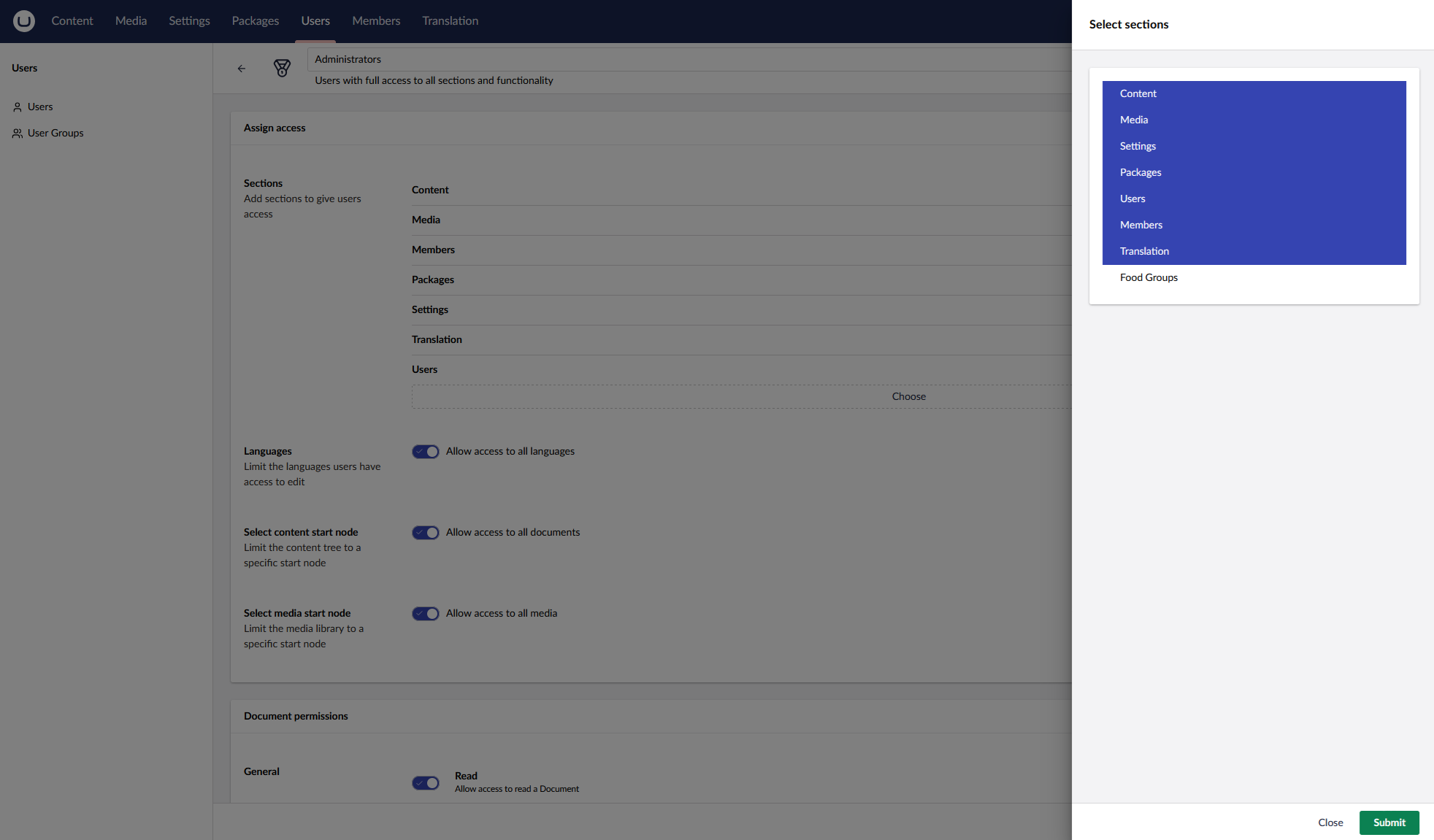
After refreshing the page, your new Food Groups section should appear in the top navigation bar.
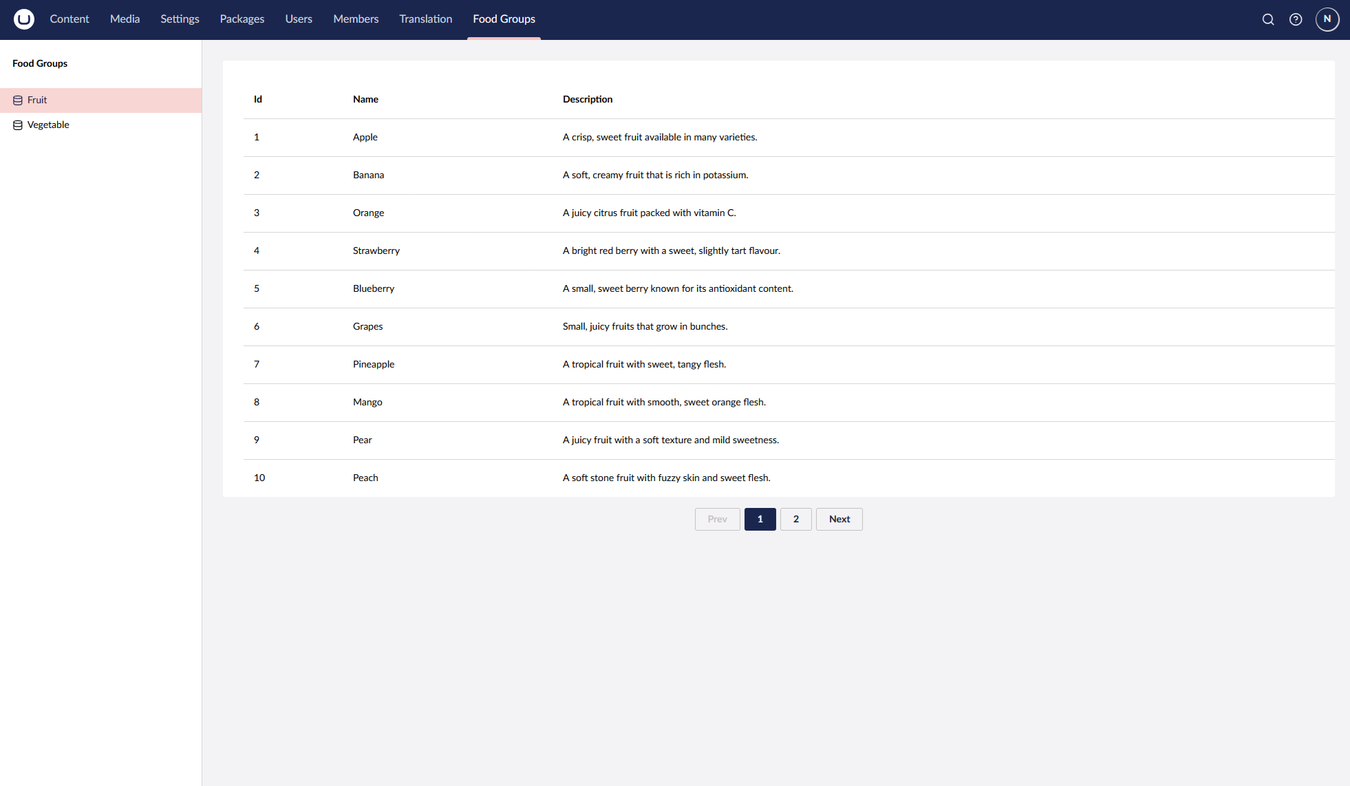
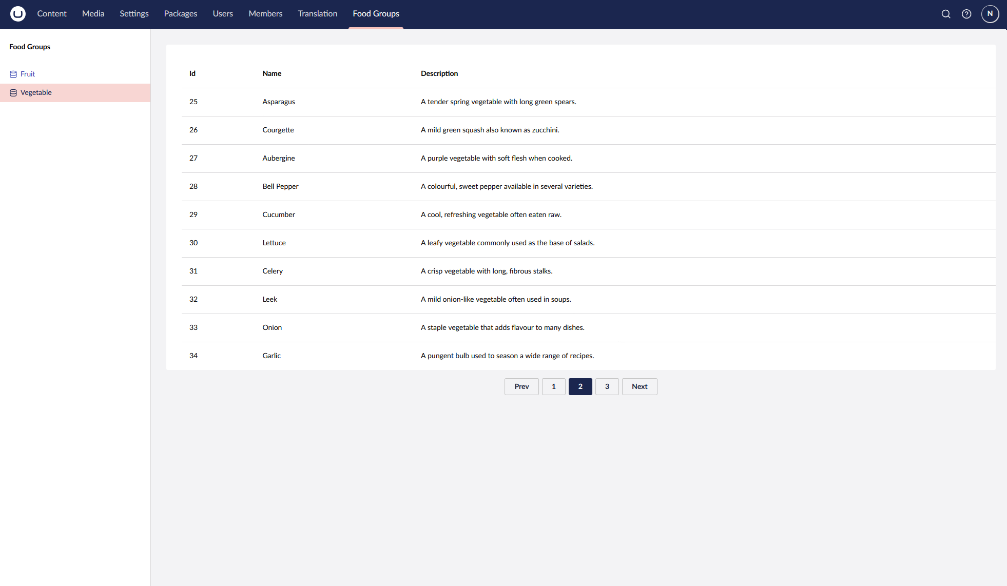
Browse to the Food Groups section and you should now see a tree containing Fruit and Vegetable options on the left-hand side. Selecting either option will display a paginated table populated with data returned from the API controller we created earlier.
Clicking through the pagination or switching between the different groups in the tree will trigger a new API call and return the relevant data for the selected option.
Improvements
This example has intentionally been kept fairly basic, but there are plenty of improvements that could be made to take this further.
It is worth exploring Umbraco’s UI documentation, as there are several built-in components that could be used to make the dashboard feel more like a native part of the backoffice. For example, adding tabs, headers, and other UI elements would help create a richer dashboard experience.
I’m also not completely convinced that the routing approach used in this example is the best option. Using query parameters works perfectly well for demonstrating the concept, but there is likely a better approach using some of the built-in routing capabilities provided by Umbraco.
That said, this should give you a solid starting point for creating your own dashboards and experimenting with what is possible using Umbraco backoffice extensions.
Conclusion
Hopefully this has given you a good starting point for building your own custom dashboards within the Umbraco backoffice using Vite and TypeScript.
Although the example dashboard is fairly simple, the same approach can be extended to create much richer backoffice experiences. By combining Umbraco’s extension APIs with the available UI components, you can build tools that feel like a natural part of the Umbraco editing experience.
If you are interested in exploring more Umbraco backoffice customisation, I have also written an article about how to build a custom property editor using Vite and TypeScript, which follows a similar approach to extending the Umbraco backoffice. This is available here on Skrift in issue 125 (March 2026).